This was such a hard one for me. I had several ways I figured I could tackle creating one and all of them but one involved paying someone a large amount of money to interpret all of my inner thoughts and feelings about what the logo would/should encapsulate. ARGHH!! The thought of talking that openly to someone about my most inner personal feelings regarding what this logo needed and had to represent sent me into my usual social anxiety black hole. No thank you!! Okay, time to regroup and go with the most passive option - Figure this one out on my own.
Here's what I had and what I knew...One of my friends recently paid a local marketing and social media firm to revamp her company. From managing content, to providing a new logo, to redoing her website, they did it all....AND...they just so happened to have an example of the finalized package that they would provide for this super not cheap lump sum. So I studied every part of that example - the color palette and why certain colors were specifically chosen, vertical and horizontal logos for various applications, social media icons, and more. I made a list of exactly what they offered, and figured that this was my baseline for 29 AND 11.
Then I re-read a TON of Jane Win's early blog posts - but mostly the ones on logo development and how she chose who to work with...I even emailed her on the off chance she had nothing better to do than respond to a random persons out of left field question....And SHE DID!! She sent me a lengthy email with inspiration boards, lists of information a graphic artist/designer would ask for (Core values, purpose, colors, inspiration, and more). Ya'll, it was so over the top. I'm still kind of at a loss for words in terms of my gratitude and feeling lifted up by another female entrepreneur. Thank you, Jane Win!!
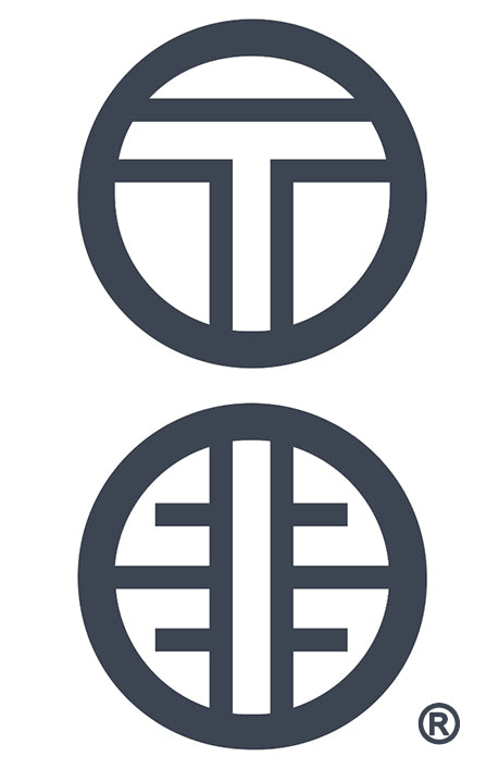
Loaded down with a defined list of what my logo needed to embody (From the colors to the purpose), I got creative the only way I know how. I stared at everything from leaves on the ground to the outlines of buildings. I walked and stared, and drove and stared. I looked at everything twice. I looked at the back of my eyeballs. Literally. And one day as I was lamenting over the fact that the company name couldn’t actually be “29:11” since that name was already taken (29 AND 11 sings to me anyways!!) and low and behold it dawned on me. I looked at the name I had originally wanted) and I saw it. The colon. Two circles that represent the connection between chapter and verse. And from there, everything I thought about was in the context of what to do with that colon.
And as unglamorous as this sounds, I was driving down the street close to our home in Fort Worth and saw a sign for a trust company. And it had these geometric T shapes that were on top of each other. And that was it. I went home and sketched knowing that I wanted the T and E of Twenty-Nine and Eleven in the circles of the colon. And I wanted them to feel as if they flowed together. I made sure to give myself ample time to ‘see things’ and not rush to create something in the absence of something not just glaring at me.
I sketched and sketched some more, until what you see today came to its final iteration. A close inspection of the colon reveals that the T in the upper circle appears to extend all the way through the second colon. It feels like a road or a path, which to me represents the journey. Which is what this is all about at the end of the day. Whether it's our journey or your journey, it represents the intent and faith that we hope to inspire you with through chapter and verse.
XOXO,
